


PRONTO Corporation Unveils New Corporate Logo on 38th Anniversary Celebration
PRONTO Corporation Unveils New Corporate Logo
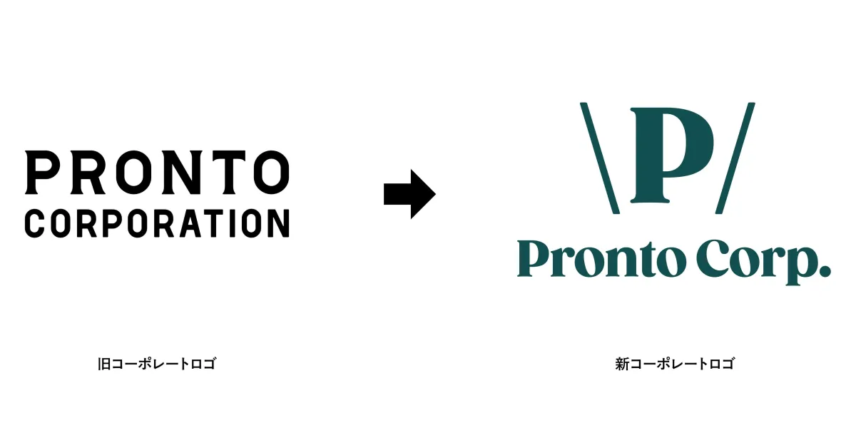
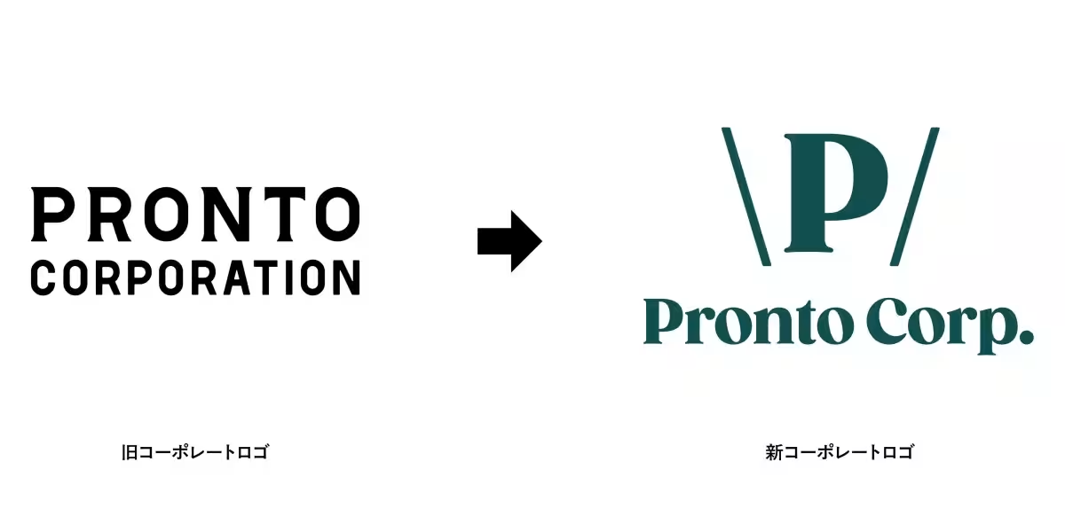
On the occasion of its 38th anniversary, PRONTO Corporation, known for its beverage chain PRONTO and wine bar Di PUNTO, has announced the launch of a fresh corporate logo effective February 1, 2026. This redesign aims to strengthen communication regarding the company's direction and values, not only for customers and employees but also for all stakeholders involved.
Background of the Logo Redesign
In today's world, where uncertainty and diversity are prevalent, companies are increasingly expected to articulate their societal purpose beyond just profit-making. This shift highlights the necessity for a clear corporate compass to navigate the evolving landscape of values, sustainability challenges, and the creation of environments where diverse talent can thrive.
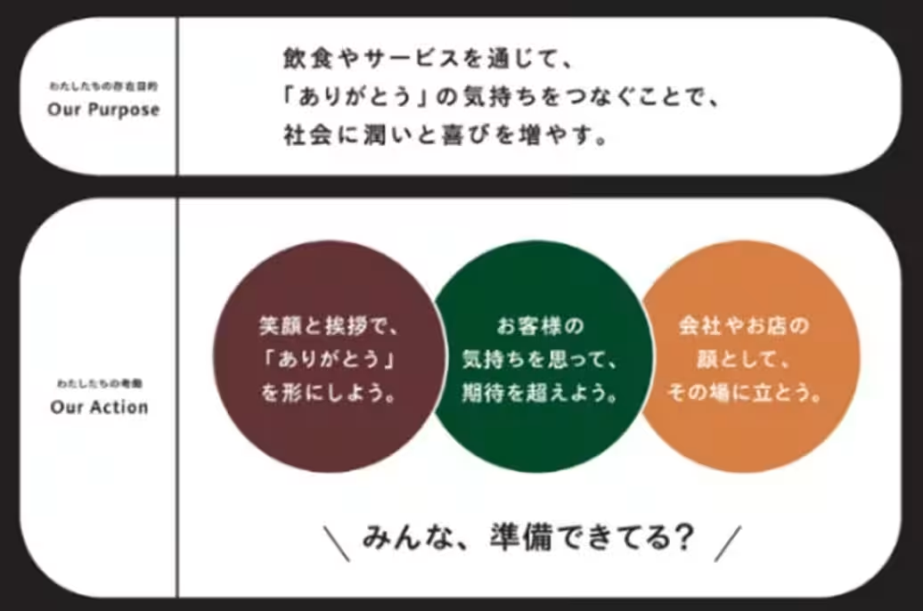
To respond to these changes, PRONTO Corporation will refresh its corporate philosophy for the first time in 20 years by the end of 2024. This updated philosophy will encompass its purpose (Our Purpose) and actionable strategies (Our Action) to clearly express its aspirations in society. The revamped logo represents an essential element of this new foundation, visually embodying the friendliness, vibrancy, and commitment to societal contribution encapsulated in the new corporate philosophy.
Concept of the New Corporate Logo
Font
The new logo incorporates a font that conveys an impression of deliciousness, essential for a dining establishment. It features organic curves, ensuring a sense of warmth and approachability—qualities that resonate with their customers.
Symbol Mark
The logo employs the form of “\P/,” which signifies greetings that connect gratitude and embodies the joyful communication of sharing meals and beverages. When viewed in silhouette, it also resembles the “containers” for food and drinks that the company provides, effectively marrying form to function.
Color
The trademark green color, first established at the company's founding, has been reinstated. This choice reflects the company’s commitment to remembering its roots and honoring the aspirations of those who have contributed to its growth. This specific shade of green is inspired by the Italian flag and is melded with a traditional Japanese color, visually representing their cultural fusion.
A Message from CEO Kazuhiro Sugiyama
Kazuhiro Sugiyama, the president of PRONTO Corporation, stated that the company aims to foster relationships that bring smiles to everyone involved—beyond merely providing food and drink. The diverse array of brands within the company attracts individuals with varying beliefs and values, and their intersection gives rise to new discoveries and cultures. As such, they have established a new purpose that serves as a mantra for shared direction, distilled into four specific actions symbolized by the updated corporate logo. Sugiyama hopes that this redesign not only enhances recognition of the company but also conveys their core values and philosophies to the public.
About PRONTO Corporation
PRONTO Corporation operates various dining concepts under the motto “A café during the day, an izakaya at night.” The versatility of its spaces caters to customers throughout the day. Their establishments include PRONTO (offering a cafe experience), Di PUNTO (a casual wine bar), È PRONTO (a comfortable self-service café), and Tsumugi (a café featuring traditional Japanese flavors). These concepts reflect PRONTO’s commitment to providing enjoyable dining experiences across a spectrum of culinary offerings.


Topics Consumer Products & Retail)


【About Using Articles】
You can freely use the title and article content by linking to the page where the article is posted.
※ Images cannot be used.
【About Links】
Links are free to use.