


MetLife Japan Introduces a New Brand Design to Enhance Customer Experience
MetLife Japan Refreshes Brand Design
MetLife Insurance Company Japan, led by CEO Dirk Osteen, is set to roll out a comprehensive brand design overhaul. This initiative aims to strengthen their commitment to being a partner in navigating the personal journeys of each customer towards a more secure future. The revamped design, which includes a new logo, color scheme, and various icons, intends to clearly convey this mission to all customers.
For years, MetLife has built its reputation based on reliability and expertise. The latest branding efforts take into account the evolving social landscape, customer lifestyles, and values, reinforcing the purpose of the company: "Walking together towards a more reliable future." This change is not just cosmetic; it seeks to foster deeper empathy and connections with customers.
The new brand strategy is also reflected in the integrated solution called "360Future," along with various products and services. It emphasizes a more straightforward communication of the value that MetLife provides and its dedication to customers. By focusing on enhancing the digital experience, the company aims to connect with customers in an increasingly efficient manner.
MetLife Japan has always aspired to be a reliable partner in its customers' lives, establishing trust through the quality of insurance products and daily engagement. The brand refresh is aimed at creating a more approachable and familiar presence that resonates well with the community.
The New Brand Design
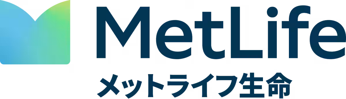
The new logo symbolizes the letter 'M' for MetLife, visually representing the company’s dedication to accompanying each customer in their life's journey. MetLife aspires to enhance the quality of experiences at every touchpoint, from sales to call centers, websites, and events. This holistic approach is designed to reinforce their image as a trustworthy and accessible entity for customers.
New Brand Logo
The logo's color palette includes a base of blue, which evokes feelings of trust, combined with green to represent positivity and growth. Together, these colors express reassurance and approachability, aligning with the firm’s vision.
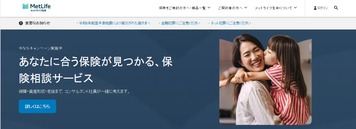
Official Website Design
In tandem with the new branding, updates to the official MetLife website will feature these fresh design elements. The website will serve as a key platform for communication, embodying the renewed values that MetLife aims to project to its clients.
MetLife Japan began operations in 1973 as the first foreign life insurance firm in the country. Currently, it stands as part of one of the world's largest life insurance groups and the Japanese arm of the parent company, MetLife Inc., headquartered in the United States. The company remains committed to helping customers choose optimal coverage through its diverse sales channels, offering innovative solutions to address a wide array of risks.
For more information, visit www.metlife.co.jp.
Topics Consumer Products & Retail)


【About Using Articles】
You can freely use the title and article content by linking to the page where the article is posted.
※ Images cannot be used.
【About Links】
Links are free to use.