A-tie Transforms Brand Identity with New Logo and Website Launch


A-tie Transforms Brand Identity with New Logo and Website Launch
A-tie, a leading consulting firm for temples in Japan, has officially launched a revamped logo and website as part of its comprehensive brand refresh aimed at enhancing its corporate identity. On September 8, 2025, the company introduced a new corporate logo, tagline, and statement that reflects its commitment to supporting human connections and enriching society.
Background of the Brand Transformation
With a mission aimed at fostering lasting human connections, A-tie has been pioneering the introduction of eternal memorial tombs to the Japanese society, a concept that caters to the evolving cultural dynamics of our super-aged society. The increasing significance of eternal memorial tombs highlights A-tie’s role as a facilitator of peace and comfort in end-of-life arrangements. Following its recent listing on the Tokyo Stock Exchange's Growth Market in June 2025, A-tie recognized the need to consolidate its brand recognition and scale its operations. This brand transformation is a strategic move to prepare for future growth and enhance its market presence.
New Tagline and Statement
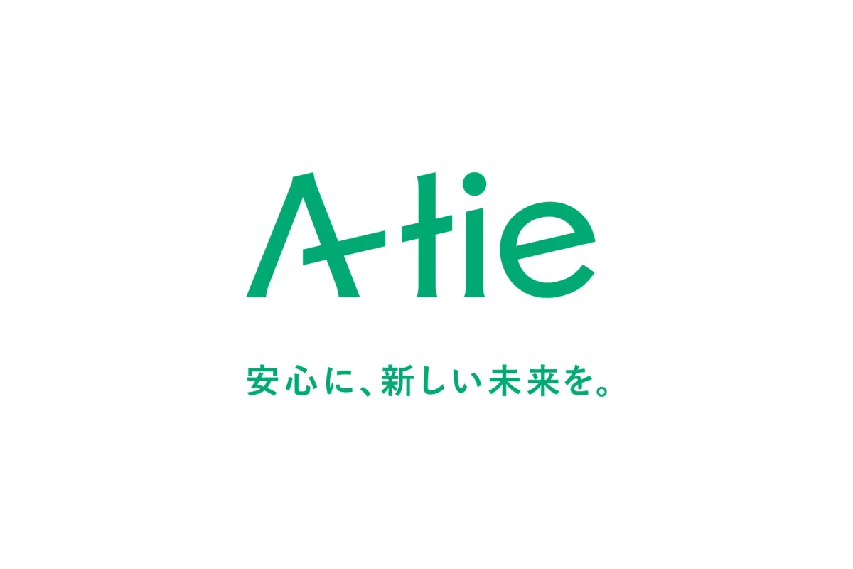
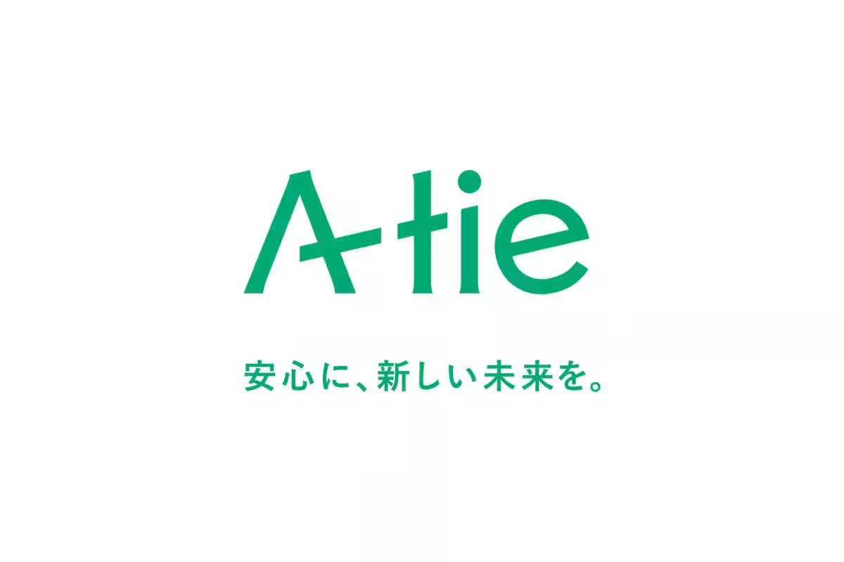
The recently coined tagline, "安心に、新しい未来を。 (A safe new future)," embodies A-tie's vision for a supportive future, emphasizing their dedication to cultivating meaningful relationships with clients. The accompanying statement conveys a heartfelt commitment to ensuring everyone can approach the future with assurance and hope, contributing to a society filled with smiles even in the face of life's final stages.
“A-tie continues to strive to connect people and bridge the present with the future, crafting services filled with security and excitement. We aspire to foster an environment where everyone has the chance to live true to themselves until the end, sharing laughter with loved ones along the way.”
Logo Design and Symbolism
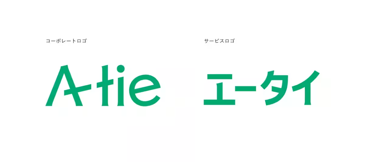
The new corporate logo is designed with an upward-moving motif, symbolizing a positive outlook on the future and sustainable growth. The logo’s cohesive design is a nod to the company's English name, "A-tie" (representing individuality and connection). Additionally, the service logo showcases the Katakana representation of the name, ensuring approachability and ease of reading for clients. The company has adopted a bright green color scheme to reflect safety and harmony, aligning with the sentiments expressed in its new statement.
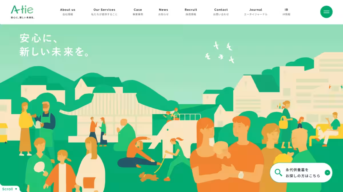
Features of the New Corporate Website
In conjunction with the new branding, A-tie has updated its corporate website to ensure a consistent brand tone and enhanced user experience. This revamped site simplifies understanding of their services, allowing clients to make informed decisions regarding memorial options. Features have been reorganized for clarity, presenting A-tie’s commitment to meaningful client engagement.
Future Ambitions
Historically, A-tie has played a crucial role in temple consulting through various services, including the planning and establishment of eternal memorial tombs, marketing, sales, and maintenance. The recent brand refresh signifies a pivotal point for the company, steering its direction under the new tagline of "安心に、新しい未来を。 (A safe new future)." A-tie is poised to redefine what safety means in the evolving landscape of memorial services.
By striving to be synonymous with memorial services in Japan, A-tie is committed to further growth strategies that cement its position in the market.
Company Overview
- - Company Name: A-tie Co., Ltd.
- - Location: 3F Crest Takebashi Building, 3-21 Kanda Nishikicho, Chiyoda-ku, Tokyo 101-0054
- - Founded: October 7, 2004
- - Representative: Ganki Kabayama, CEO
- - Market Listing: Tokyo Stock Exchange Growth Market (Ticker Code: 369A)
- - Business Focus: Temple consulting services (planning and establishment of memorial tombs, sales representation, and maintenance for cemetery users)
A-tie is actively looking for partner temples to help build a secure future together. For inquiries, visit: Contact Us.
Topics Consumer Products & Retail)


【About Using Articles】
You can freely use the title and article content by linking to the page where the article is posted.
※ Images cannot be used.
【About Links】
Links are free to use.