


Blue Puddle Celebrates a Decade with a Full Brand Transformation and New CI Tools
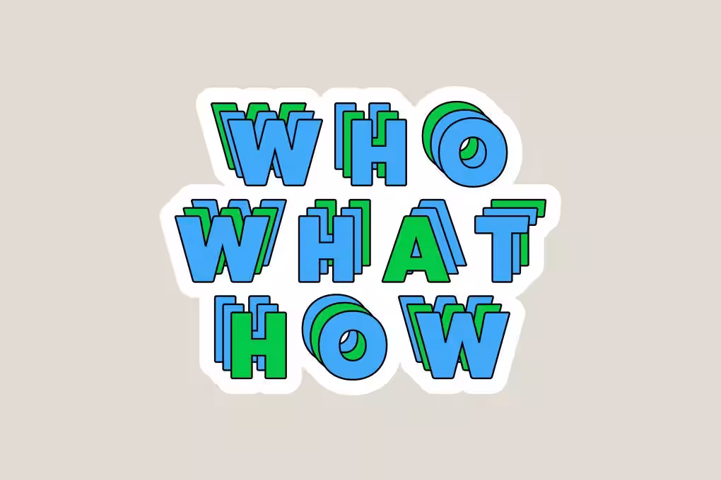
SI (Sticker Identity). This ambitious initiative commenced with a two-month strategic reassessment focusing on key aspects such as 'WHO' (Who are our customers?) and 'WHAT' (What value do we offer?).
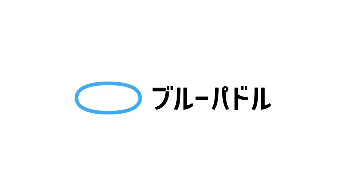
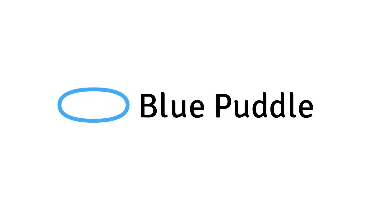
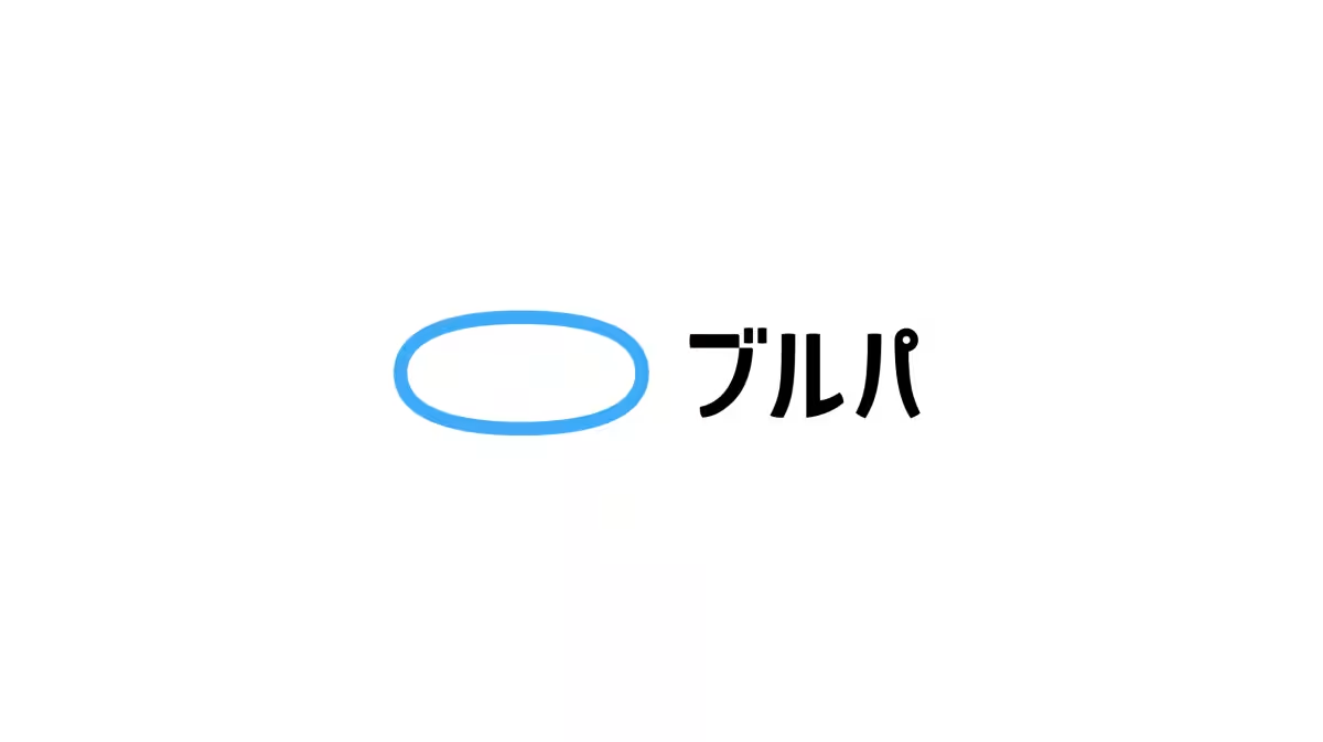
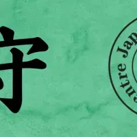
Recognizing that its primary target audience consists of new corporate representatives, Blue Puddle made the strategic choice to shift from an English logo to a Japanese one. Given that 'Blue Puddle' is often difficult for many to pronounce correctly, this change aligns perfectly with the 10th-anniversary milestone. While it is uncommon for a design company known for its English logo to transition to a Japanese version, this decision is a function of well-grounded planning. The English logo will still be in use alongside the new responsive logo, capable of adapting its size and layout depending on different usage scenarios.
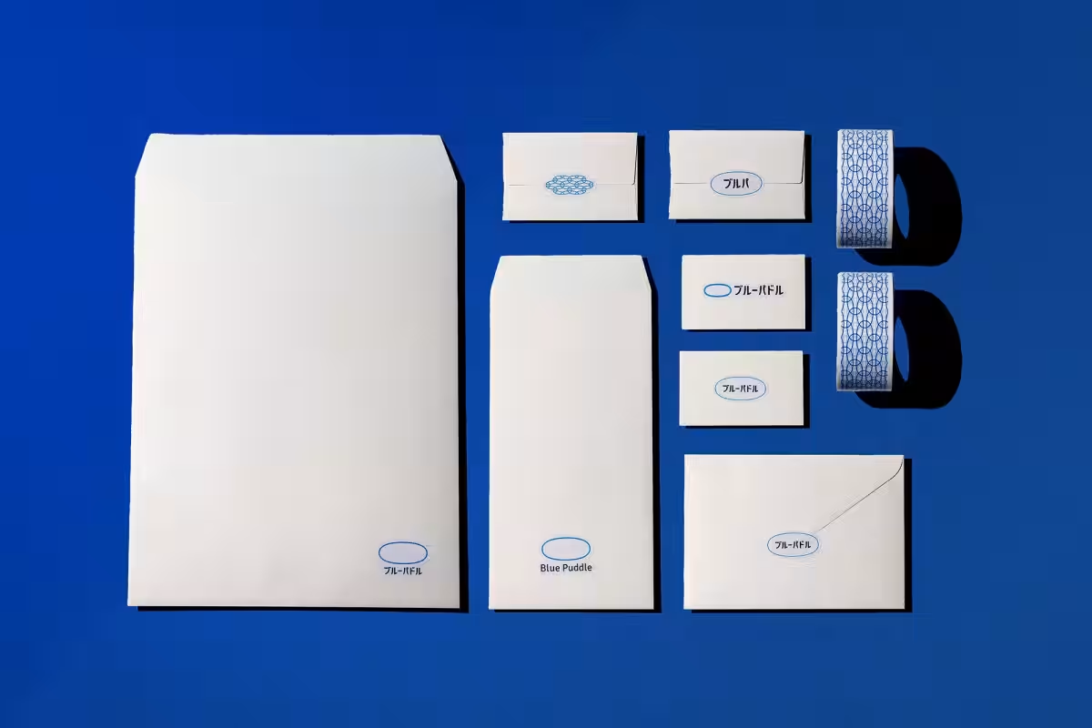
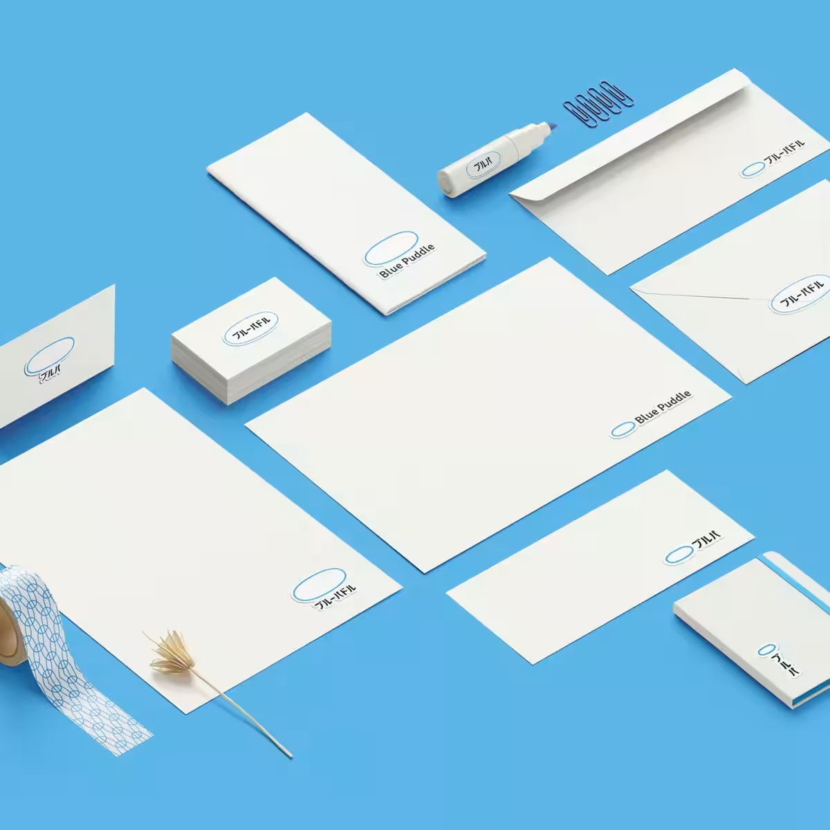
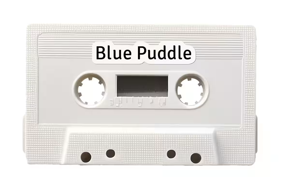
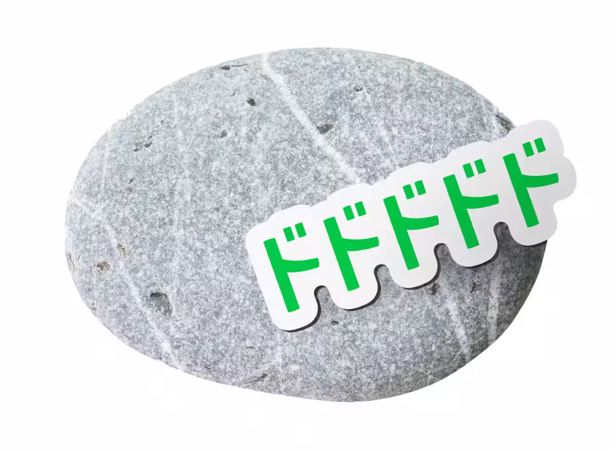
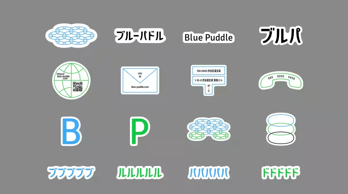
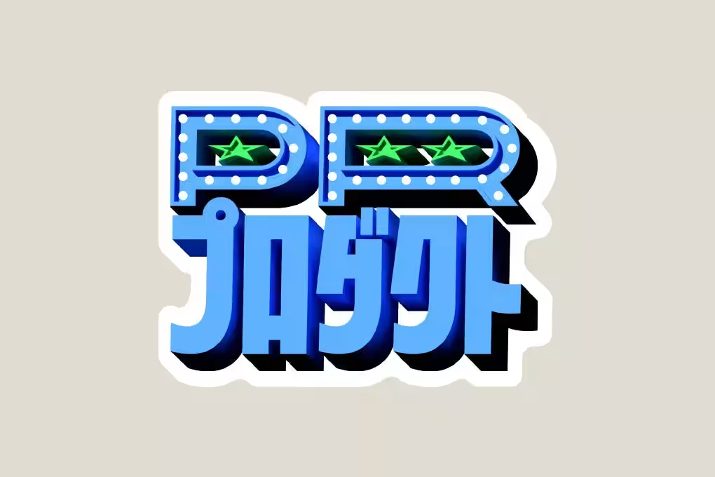
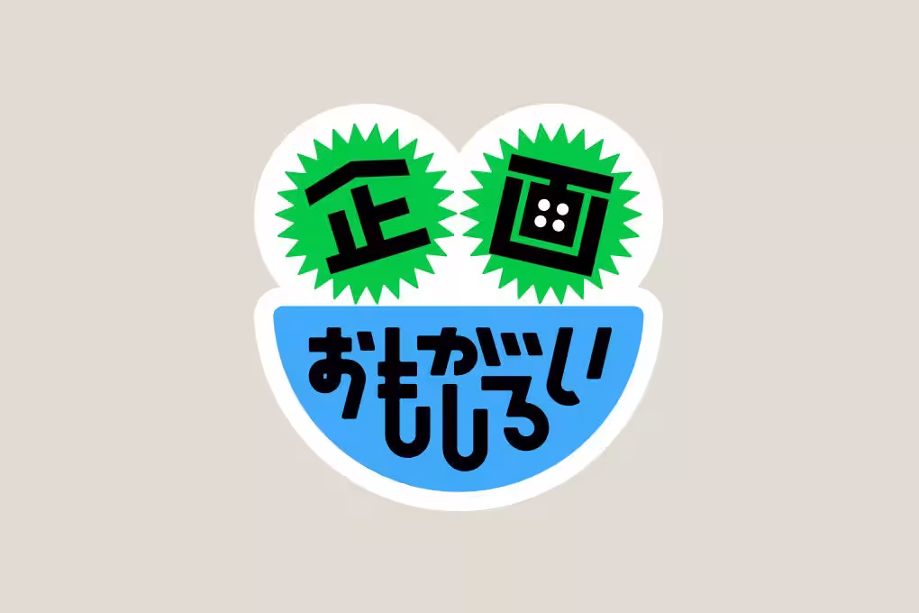
In line with CI enhancements, the company considered a range of CI tools such as envelopes and paper bags. However, realizing they were not practical for frequent use, the decision was made to launch the new 'SI (Sticker Identity),' enabling versatility. By simply applying a sticker, items like cardboard boxes, envelopes, and even cassette tapes can become branded tools. This new approach caters particularly well to small businesses and creators who would otherwise be burdened by the costs and storage issues stemming from mass-printed materials. With SI, branding can happen as needed, whenever necessary.
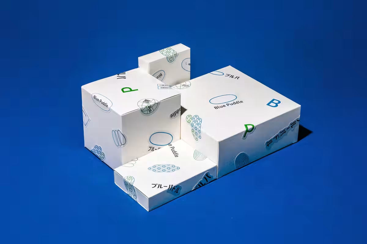
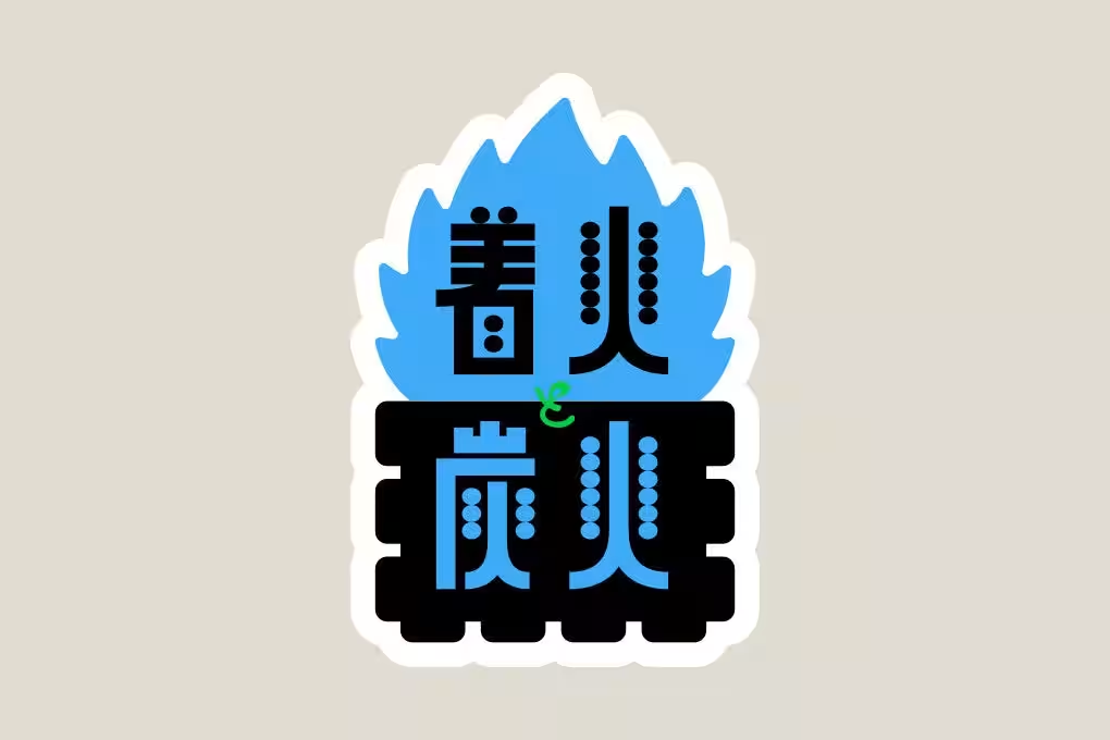
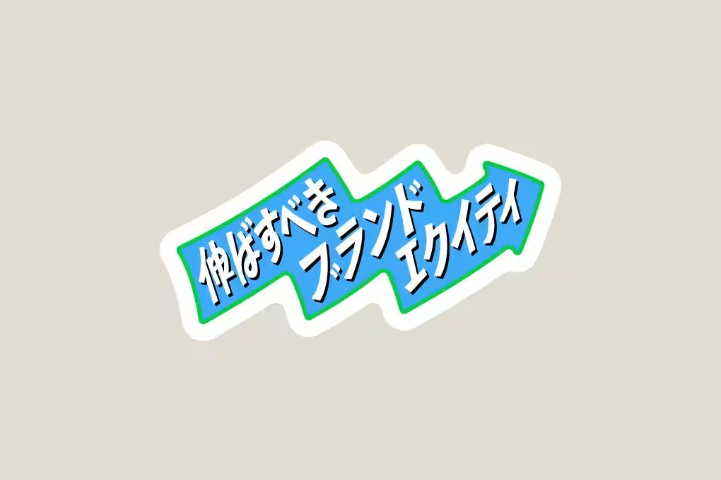
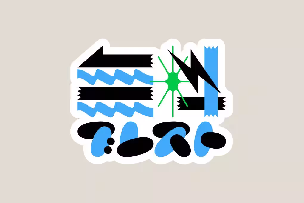
Further amplifying their CI approach, Blue Puddle translated key elements of brand equity directly into sticker forms. Brand equity encompasses the recognition and image associated with the brand; the stronger the brand is imprinted in the audience's mind, the more likely it is to be preferred. However, many businesses overlook the practical application of typography to communicate these essential image keywords. Instead, Blue Puddle’s design successfully integrates this concept into their branding strategy.
The refreshed website aims not for flashy gimmicks but to truly embody Blue Puddle’s strategic equity. Prior to its re-design, a two-month deep dive into understanding 'who' their customers are and 'what' their deepest desires include was conducted, eventually leading to the crystallization of their corporate values. Every aspect of this strategy has been meticulously integrated into the website's design.
1. Material Format Mode: A unique switching feature allows users to view project summaries in a slide-like format, resembling a presentation, making information easy to access without navigating to separate pages.
2. Swipe Menu for Mobile: To eliminate the inconvenience of tapping on a hamburger menu, the site now includes a light swipe functionality that opens the menu with a simple swipe, reacting to angles and swipe lengths.
3. Hover for Problem-Solution Display: The PC version of the site provides hover features over project listings that disclose detailed challenges and solutions, aligning with a customer-centric view of showcasing success stories.
For those interested in a comprehensive understanding of the strategy and website creation process, more detailed accounts can be found in related posts on note:
For inquiries, please reach out to: [email protected]


CI Refresh: From English to Japanese Logo
Recognizing that its primary target audience consists of new corporate representatives, Blue Puddle made the strategic choice to shift from an English logo to a Japanese one. Given that 'Blue Puddle' is often difficult for many to pronounce correctly, this change aligns perfectly with the 10th-anniversary milestone. While it is uncommon for a design company known for its English logo to transition to a Japanese version, this decision is a function of well-grounded planning. The English logo will still be in use alongside the new responsive logo, capable of adapting its size and layout depending on different usage scenarios.
The Introduction of Sticker Identity (SI)
In line with CI enhancements, the company considered a range of CI tools such as envelopes and paper bags. However, realizing they were not practical for frequent use, the decision was made to launch the new 'SI (Sticker Identity),' enabling versatility. By simply applying a sticker, items like cardboard boxes, envelopes, and even cassette tapes can become branded tools. This new approach caters particularly well to small businesses and creators who would otherwise be burdened by the costs and storage issues stemming from mass-printed materials. With SI, branding can happen as needed, whenever necessary.
Utilizing Brand Equity through Stickers
Further amplifying their CI approach, Blue Puddle translated key elements of brand equity directly into sticker forms. Brand equity encompasses the recognition and image associated with the brand; the stronger the brand is imprinted in the audience's mind, the more likely it is to be preferred. However, many businesses overlook the practical application of typography to communicate these essential image keywords. Instead, Blue Puddle’s design successfully integrates this concept into their branding strategy.
Website Revamp: Creating a Strategy-Driven Web Experience
The refreshed website aims not for flashy gimmicks but to truly embody Blue Puddle’s strategic equity. Prior to its re-design, a two-month deep dive into understanding 'who' their customers are and 'what' their deepest desires include was conducted, eventually leading to the crystallization of their corporate values. Every aspect of this strategy has been meticulously integrated into the website's design.
Creative Features of the New Website
1. Material Format Mode: A unique switching feature allows users to view project summaries in a slide-like format, resembling a presentation, making information easy to access without navigating to separate pages.
2. Swipe Menu for Mobile: To eliminate the inconvenience of tapping on a hamburger menu, the site now includes a light swipe functionality that opens the menu with a simple swipe, reacting to angles and swipe lengths.
3. Hover for Problem-Solution Display: The PC version of the site provides hover features over project listings that disclose detailed challenges and solutions, aligning with a customer-centric view of showcasing success stories.
For those interested in a comprehensive understanding of the strategy and website creation process, more detailed accounts can be found in related posts on note:
Credits
- - Creative Director: Neji Sato
- - Graphic Designer: Kanki Shimizu
- - Web Engineer: Ryuichi Hayashi
Company Overview
- - Company Name: Blue Puddle Co., Ltd.
- - Representative: Neji Sato
- - Established: July 2016
- - Website: Blue Puddle Website
- - Business Scope: Corporate and brand strategy design, planning, design, web and content production.
Contact Information
For inquiries, please reach out to: [email protected]
Topics Consumer Products & Retail)


【About Using Articles】
You can freely use the title and article content by linking to the page where the article is posted.
※ Images cannot be used.
【About Links】
Links are free to use.