Satis Corporation Unveils a Fresh Brand Logo Representing Trust and Innovation


Satis Corporation Unveils a Fresh Brand Logo
Satis Corporation, headquartered in Chiyoda, Tokyo, under the leadership of CEO Ryota Hayashi, has recently announced a revitalization of its brand logo. This new logo serves as a visual representation of Satis's core values, emphasizing trust, stability, innovation, and a forward-thinking approach to technology.
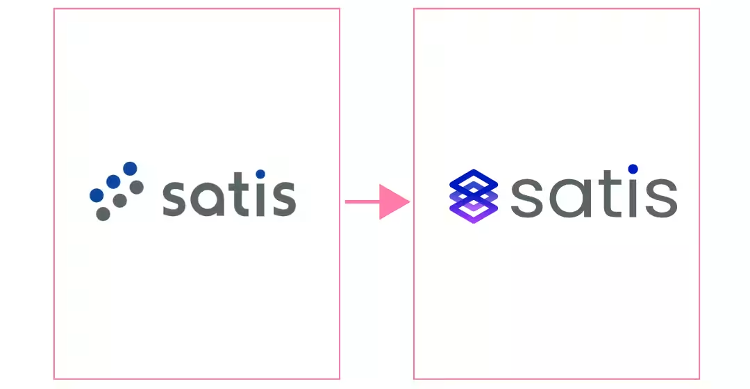
From Old to New
The Message Behind the New Logo: Reliability and Infinite Innovation
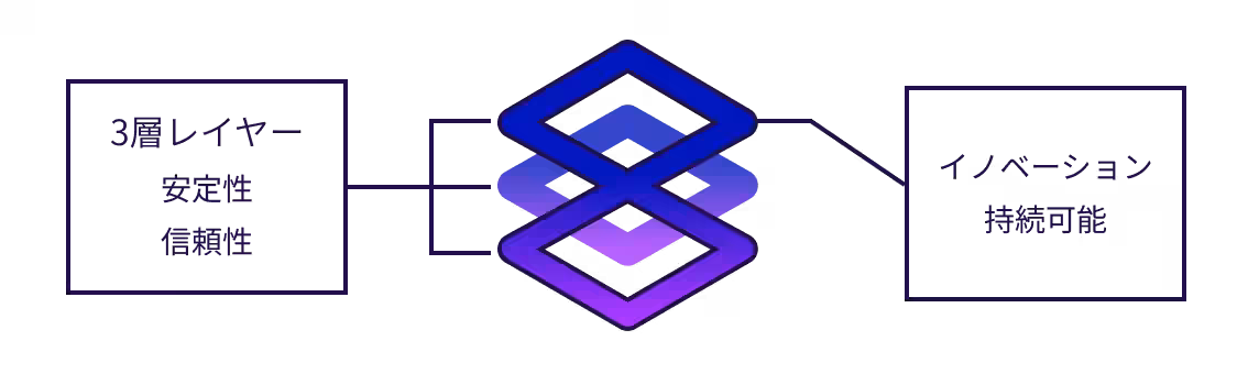
The redesigned logo captures the essence of what Satis stands for by showcasing two fundamental axes that symbolize its identity. This transformation is not just about a new look; it embodies Satis's mission of driving change through unwavering trust, supporting customers in their digital transformation (DX), and building a stable future through continued evolution.
The Infinite Symbol of Innovation and Future Orientation
At the center of the new logo is an infinity symbol (∞), representing Satis's ongoing commitment to technological innovation and adaptability in an ever-changing landscape. This imagery encapsulates the company’s resolve to create new value while seamlessly integrating ongoing changes into its operations.
The new logo is designed to communicate these concepts intuitively through a clean and approachable aesthetic, making it easily recognizable to anyone.
Significance of Brand Color: Satis Blue
The new logo color embodies Satis’s corporate philosophy:
- - High Technical Expertise and Reliability: The blue hue symbolizes the solid technical capability and the flexible adaptability to meet diverse needs, fostering a sense of continuing trust among clients.
- - Distinctive Innovation: It represents Satis's commitment to creating new value as it moves toward the future.
Behind the Scenes: Crafting the New Logo
In the process of creating the new logo, Satis engaged in numerous iterations and refinements over approximately three months. The focus was on developing not just a visual representation but a symbol that intuitively conveys the essence of
Topics Other)
【About Using Articles】
You can freely use the title and article content by linking to the page where the article is posted.
※ Images cannot be used.
【About Links】
Links are free to use.