


SKF's Brand Refresh Celebrated with Prestigious Red Dot Awards Recognition
SKF's Brand Refresh Celebrated with Prestigious Red Dot Awards Recognition
In the spring of 2025, SKF, in partnership with the design agency NORD ID at NORD DDB, introduced a revamped brand identity that has recently garnered significant accolades, winning two Red Dot Awards, a prestigious recognition in the global design community. This marks a notable achievement for SKF as it celebrates its first-ever double win at the Red Dot Design Award, renowned for showcasing excellence in design and business.
The awards received by SKF include one for their new Display font and the coveted 'Best of the Best' for the entire brand update. "Red Dot is an international mark of excellence in design and business," said Daniel Sjöstrand, Head of Brand at SKF. The dual recognition highlights the company’s commitment to innovation while emphasizing a design aesthetic that resonates with both its historical roots and future aspirations.
SKF, a titan in reducing friction for over a century, aimed to enhance its visual language to better mirror its expertise and contributions within the industry. The refreshed brand identity is not merely a cosmetic change; it represents a strategic effort to address the gap between SKF's global impact and its public perception. The new identity focuses heavily on innovation, sustainability, and leadership within the industry, showcasing how far the company has come while looking forward.
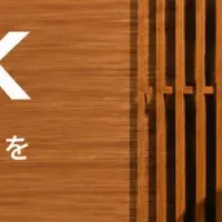
The design process, led by NORD ID, sought inspiration from SKF's 117-year-old logo, initially hand-painted by an employee. By modernizing this classic emblem, the design team preserved its character while expanding it into a complete typeface tailored for the digital age. "We recognized how SKF's 1908 logo captured a sense of modernity and vision that still resonates today. Instead of creating something entirely new, we aimed to elevate this historical design for current and future contexts," explained Martin Andersson, Design Director at NORD ID.
The excitement surrounding the launch of the new visual identity has been palpable throughout design, business, and industrial communities. The updated branding not only illustrates the evolution of SKF as a business but also plays a critical role in attracting a broader customer base, ultimately driving profitable growth as the company seeks to further establish itself as an industry leader.
Per Nilsson, Director of Group Communication at SKF, emphasized the strategic importance of the fresh identity in building favorability among customers, investors, and partners alike. It reflects the company that SKF has become—a company that stands out in a competitive landscape, committed to driving meaningful and sustainable innovation.
This recognition will be celebrated in person at the awards ceremony scheduled for November 7th, 2025, in Berlin, Germany. This event marks a significant moment for SKF and its continual journey towards enhancing its brand image while maintaining the essence of what has made it a pioneering force in the industry.
The Red Dot Design Award is one of the largest and most respected competitions dedicated to recognizing top-notch design across various disciplines, including product design, brand and communication design, and design concepts. Winning these awards not only affirms SKF's design ingenuity but also helps to solidify its brand identity in a way that echoes through time—a perfect blend of tradition and modernity.
As SKF moves forward, it remains committed to leveraging its heritage and innovation to push boundaries, setting a standard for what it means to be a leader in design and industry excellence. After being recognized on such a global platform, the future looks promising for SKF as they strive for even greater achievements in the years to come.
Topics Consumer Products & Retail)


【About Using Articles】
You can freely use the title and article content by linking to the page where the article is posted.
※ Images cannot be used.
【About Links】
Links are free to use.