Exploring Fonts: Insights from Working Men and Women on Typography Preferences


Survey on Font Preferences Among Working Individuals
A recent survey conducted by Morisawa, a leading font manufacturer in Japan, delves into font preferences and experiences among working men and women aged 20 to 50. This study aims to uncover how typography affects communication in professional contexts, especially as the Osaka-Kansai Expo approaches.
Survey Overview
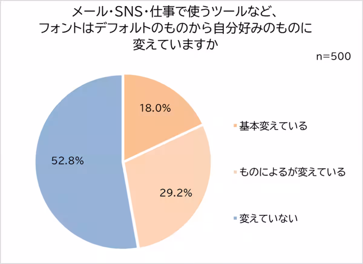
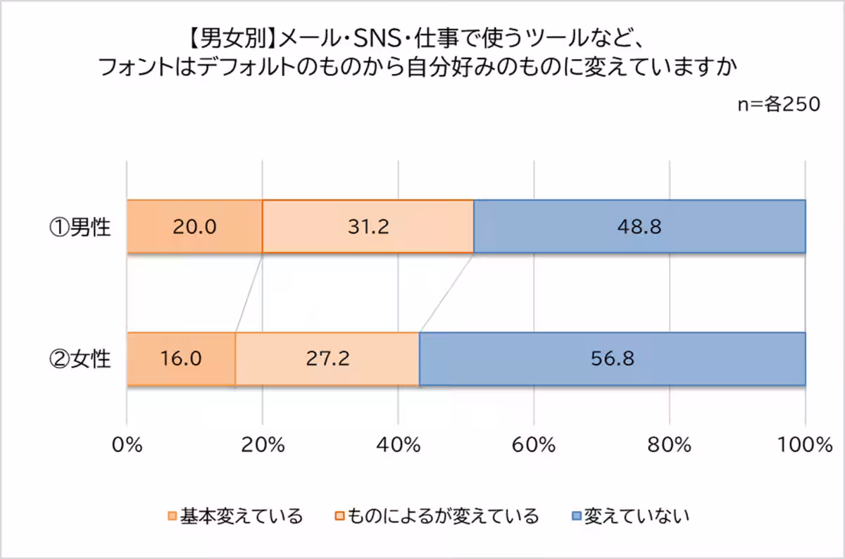
The survey included responses from 500 individuals and sought to understand their font usage, preferences, and experiences. Key findings reveal that more than 40% of participants have specific font preferences, and approximately half strategically choose fonts based on the context of their communication.
Key Findings
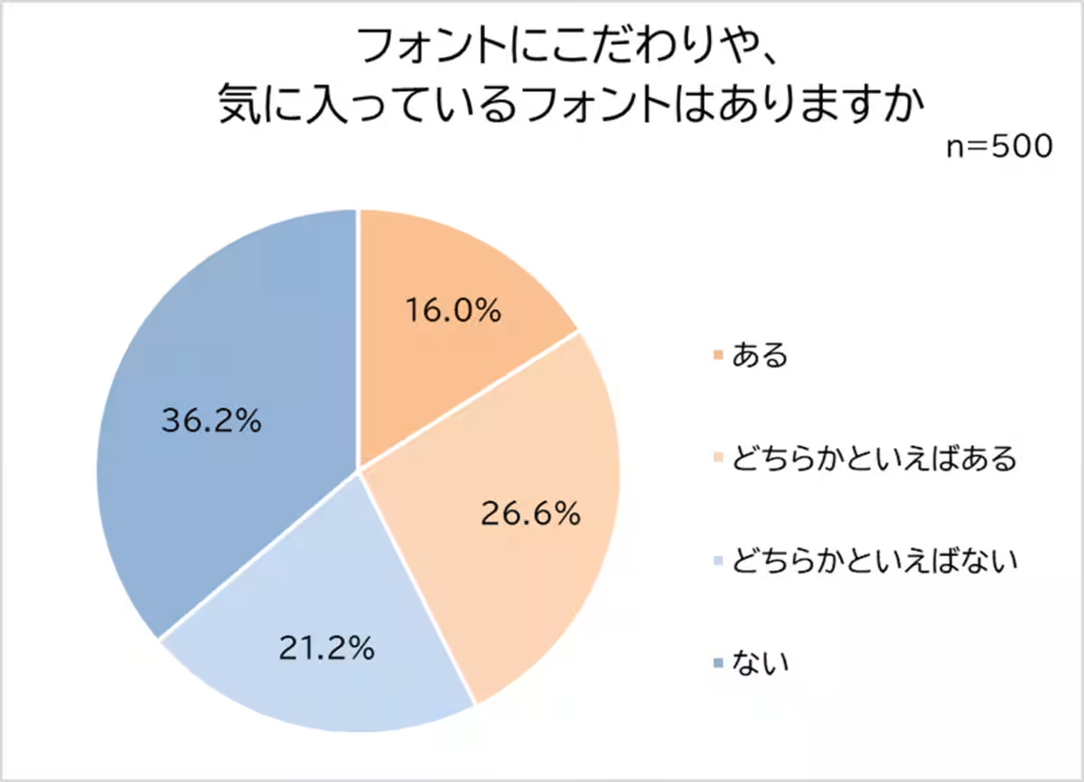
1. Font Preferences
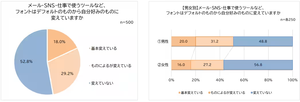
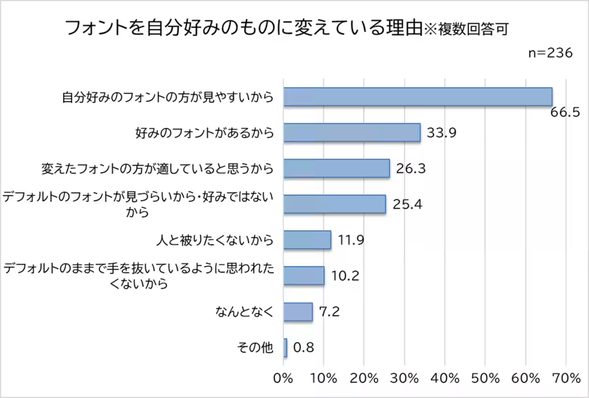
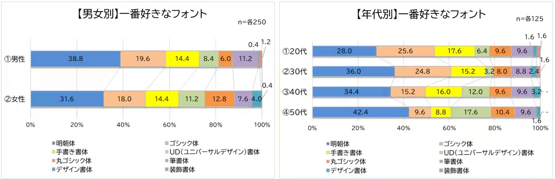
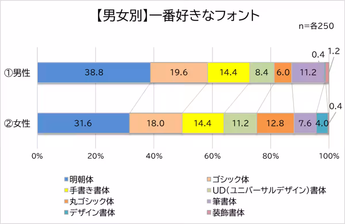
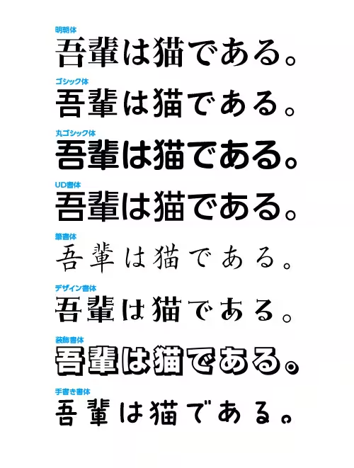
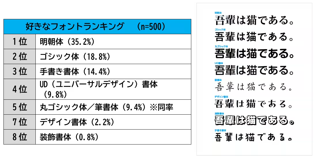
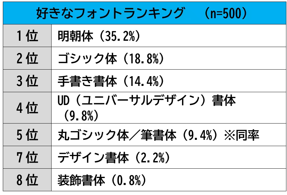
Over 40% of respondents have a fondness for particular fonts. About half reported changing the default fonts to ones they prefer, with the primary reason being readability. The favorite fonts were ranked as follows:
- 1st: Mincho (35.2%)
- 2nd: Gothic (18.8%)
- 3rd: Handwritten styles (14.4%)
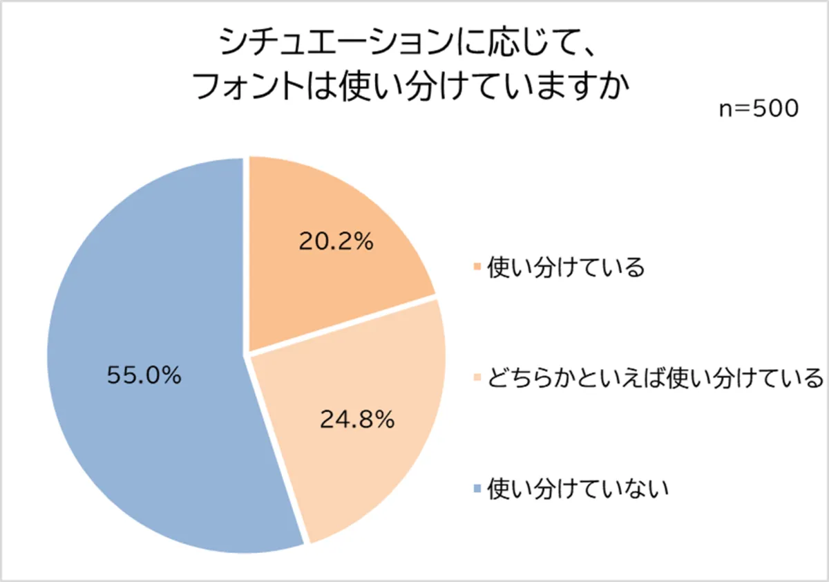
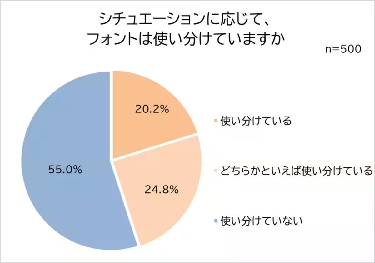
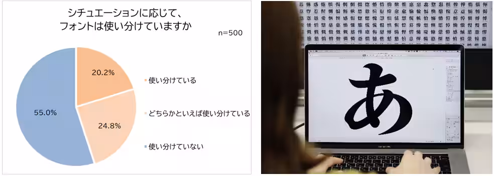
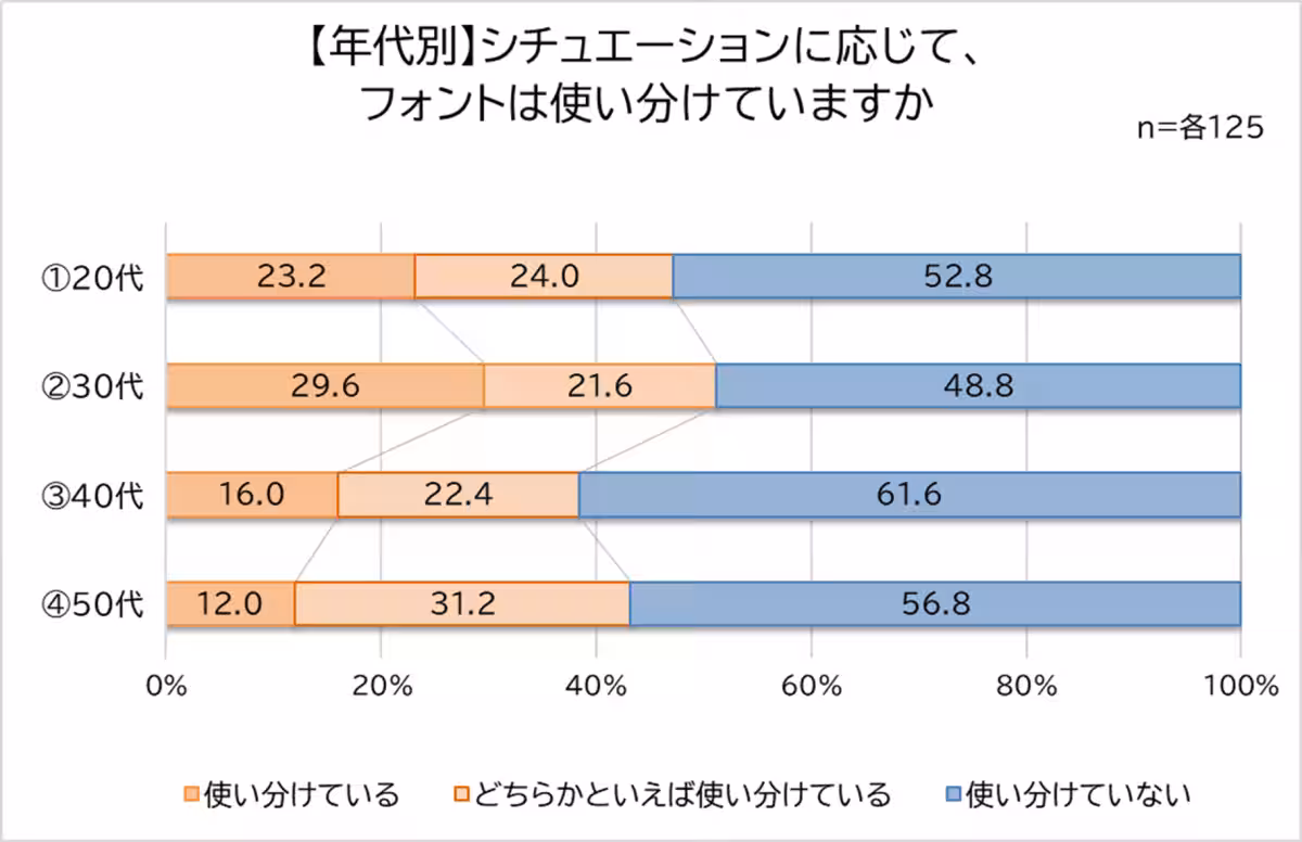
2. Contextual Font Usage
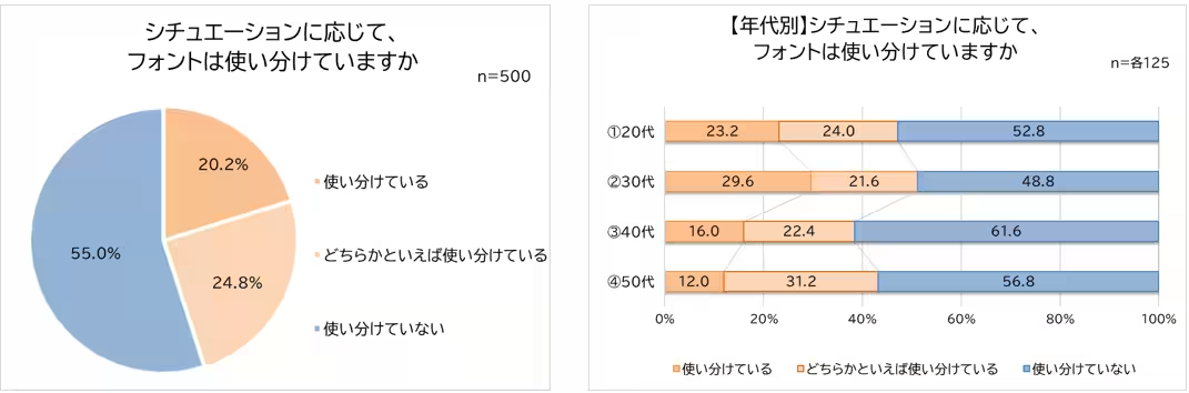
Approximately 45% of participants admitted to selecting different fonts depending on the situation. Younger individuals, particularly in their 20s and 30s, were more proactive in using varying fonts. Here are ten scenarios where people choose different fonts:
- Using respectful fonts based on hierarchy in business emails.
- Opting for easier-to-read fonts for older readers.
- Choosing playful fonts for fun projects, versus formal ones for business documents.
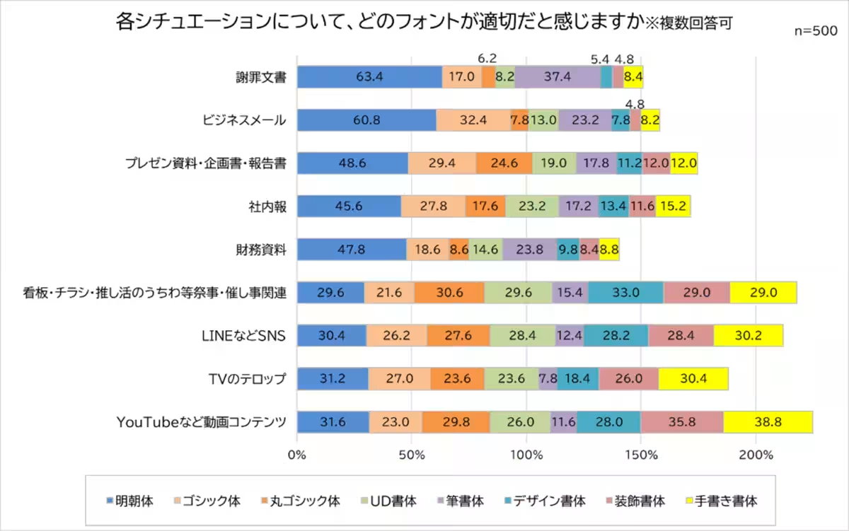
3. Perceptions of Appropriate Fonts
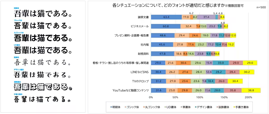
A significant 60% believe that Mincho is the most suitable font for apology letters, indicating a strong preference for professional and serious contexts. Conversely, awareness of font appropriateness was highlighted, as one-third of respondents noted feeling discomfort when a font did not match the document's tone.
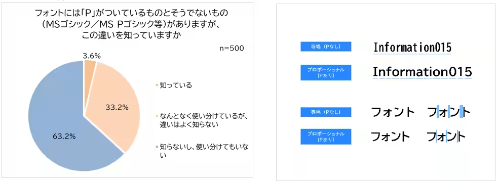
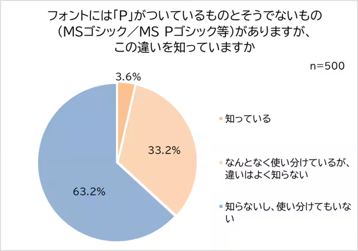
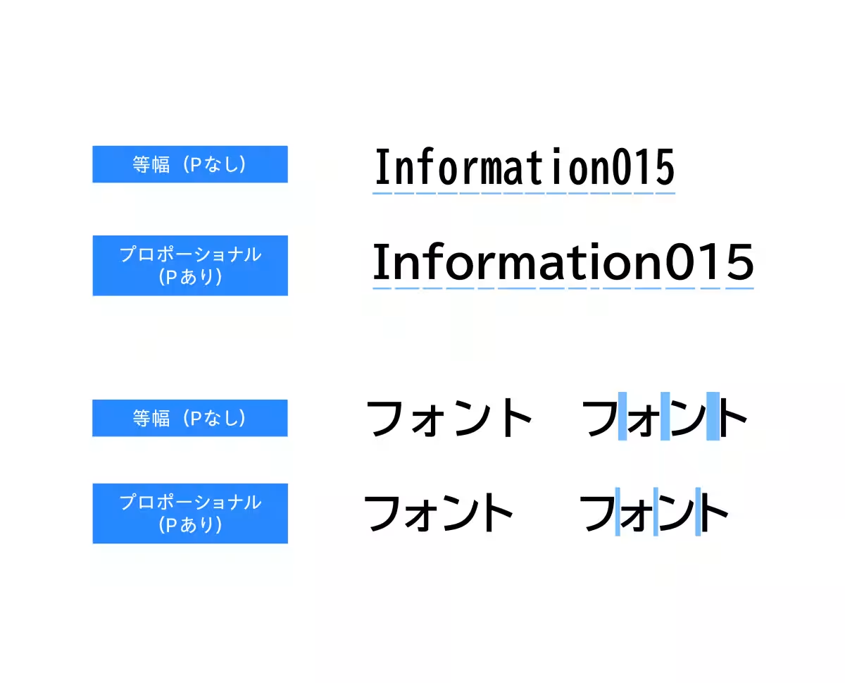
4. Knowledge of Fonts
The survey identified a concerning lack of knowledge surrounding font classifications. Only 3.6% recognized the significance of fonts with a 'P' designation indicating proportional fonts, suggesting a gap in typographic education.
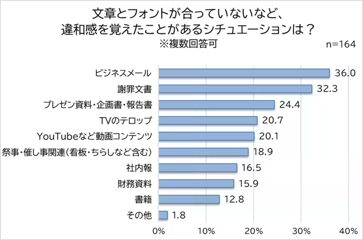
5. Font and Document Mismatch
About one-third of participants recalled instances where mismatched fonts caused discomfort. The scenarios where this discomfort arose most were in business emails (36%) and apology letters (32%).
Methodology
- - Theme: Awareness and Attitudes Towards Fonts
- - Method: Online survey
- - Participants: 500 working men and women aged 20 to 50
- - Duration: August 20 – 22, 2025
- - Conducted by: Morisawa, with collaboration from Neo Marketing.
Conclusion
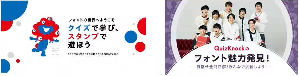
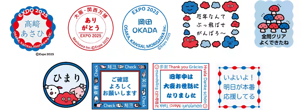
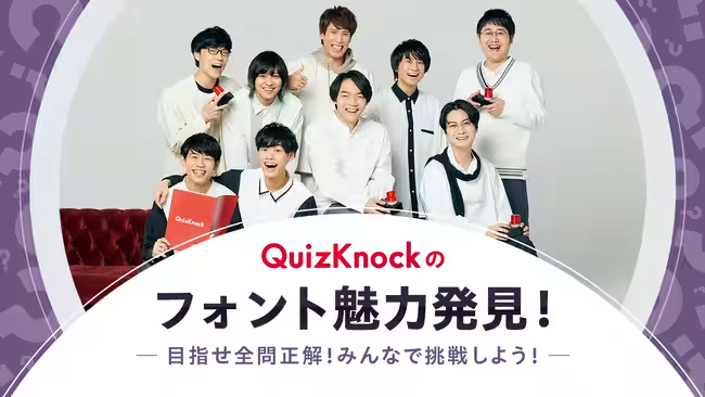
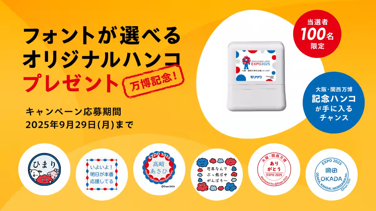
As Morisawa prepares for the Osaka-Kansai Expo, they have launched an innovative platform called 'Font de Stamp', allowing users to create original digital stamps using their favorite fonts. This platform not only emphasizes the importance of font choices but also provides an opportunity for creative expression. With the release of educational quizzes in collaboration with QuizKnock, Morisawa aims to enhance public awareness of typography.
The study underscores the vital role that fonts play in professional communication, highlighting how they influence perceptions and emotional responses. As businesses increasingly realize the significance of written communication, the right choice of font becomes imperative for effectively conveying sincerity and professionalism.

Topics Consumer Products & Retail)


【About Using Articles】
You can freely use the title and article content by linking to the page where the article is posted.
※ Images cannot be used.
【About Links】
Links are free to use.