
Revamping Workkit: The New Era of Office Design by Hitoba Design


Revamping Workkit: A Fresh Start for Office Design
Hitoba Design, headquartered in Shibuya, Tokyo, has recently undertaken a significant transformation of its office design project, Workkit. As part of this initiative, both the corporate website and logo were completely overhauled, all in anticipation of the company celebrating its 15th anniversary this coming November. The renowned design firm SHIFTBRAIN led this redesign project. This comprehensive workflow aimed to reassess and redefine the brand's essence, revisiting the principles and ideals the company has cultivated over the years.
Background of the Renewal
Workkit has consistently aimed to enrich the working environment and enhance the overall experience for employees through meticulous office design. However, the corporate site, which serves as the primary connection point between the company and its clients, had fallen behind in updating its design and was no longer effectively communicating the brand's vision or values.
The existing site had surpassed its useful life, creating a challenge in delivering crucial aspects such as project achievements, the philosophies behind each project, and the relationships built with clients. It became clear that there was a pressing need to articulate these core values effectively. Rather than merely refreshing the design, the objective shifted towards undertaking a project that involved a fundamental re-examination and redefinition of the brand itself.
Goals of the Renewal
The revamping process aimed to achieve several key objectives:
- - A comprehensive overhaul of the site map to optimize and streamline information delivery.
- - Linguistically articulating the company’s strengths and unique characteristics to redefine the brand’s identity.
- - Creating a structure and design that resonates with and earns the trust of target users.
- - Not being perceived solely as a service provider for design and construction, but as a collaborative partner in co-creation.
Key Features of the Renewal
1. New Brand Logo
The refreshed logo embodies a quiet elegance that harmonizes with various spaces while exuding a strong core stance. The design reflects the universal appeal of the Workkit brand, showcasing its unique characteristics as conceived by SHIFTBRAIN.
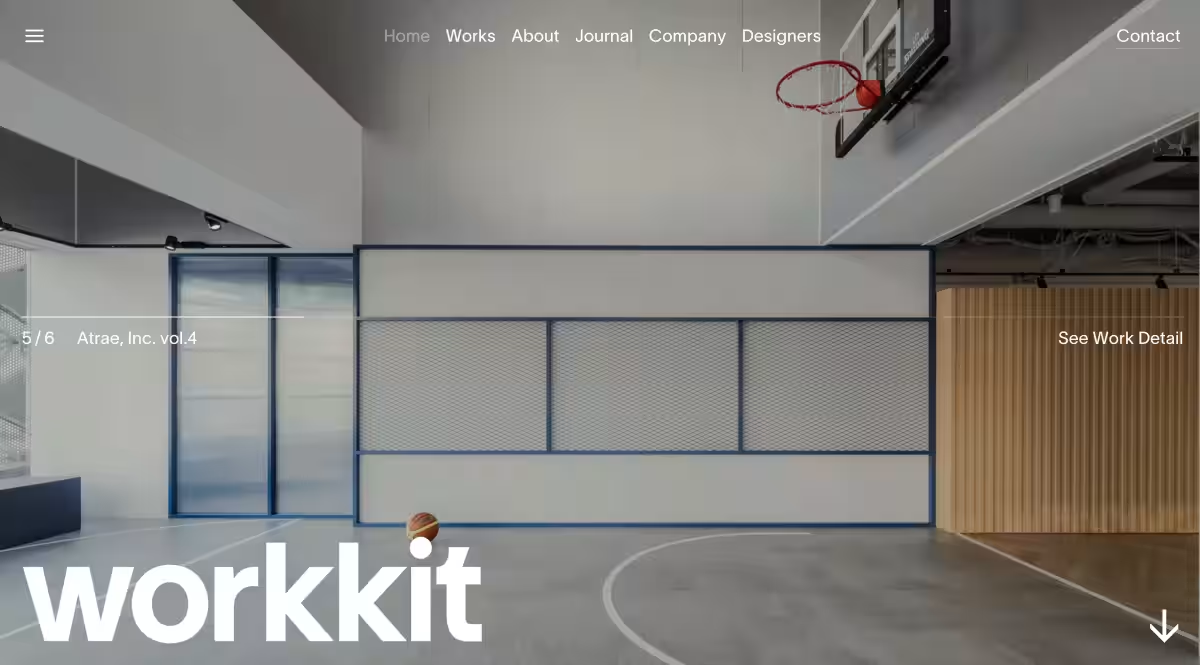
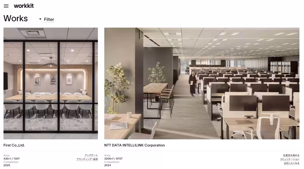
2. Visual Design Centered Around Case Studies
To provide an intuitive and visually rich experience, the website now prioritizes case study photographs designed to convey the diversity and scale of office design vividly. This layout successfully communicates the ambiance and broad scope of previous projects.
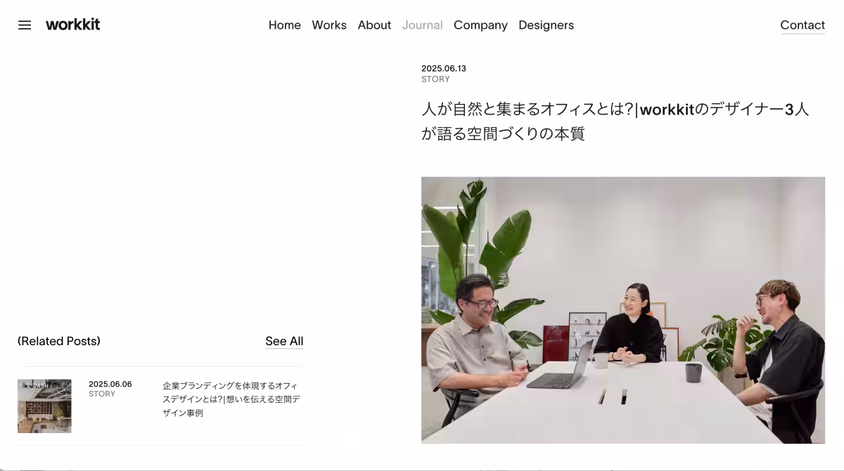
3. Structured Information Design Conveying Concepts and Team Ethos
The site now features an expanded content offering that clearly articulates the project methodologies, team attitudes, and the creative process. It organizes design philosophies and foundational thoughts in a way that is straightforward and easy to comprehend.
Future Outlook
Through this renewal, Hitoba Design is better positioned to deliver its cherished beliefs and concepts clearly and effectively. The company recognizes that an office is not just a finished product but a space that should grow and evolve alongside its clients, understanding their management and operational needs. This approach will remain vital as Hitoba Design continues fostering growth and collaboration with its clients.
For more details, check out the newly revamped site at Hitoba Office.
- ---
Company Overview
- - Company Name: Hitoba Design Co., Ltd.
- - Location: 3-59-4 Sendagaya, Shibuya-ku, Tokyo 151-0051, Japan
- - Representative: Seigo Sato
- - Founded: November 2011
- - Business Activities: Office design, spatial design, branding support
Topics Consumer Products & Retail)
【About Using Articles】
You can freely use the title and article content by linking to the page where the article is posted.
※ Images cannot be used.
【About Links】
Links are free to use.