



TASUKI Consulting Revamps Corporate Brand to Connect Futures
TASUKI Consulting's Corporate Brand Refresh
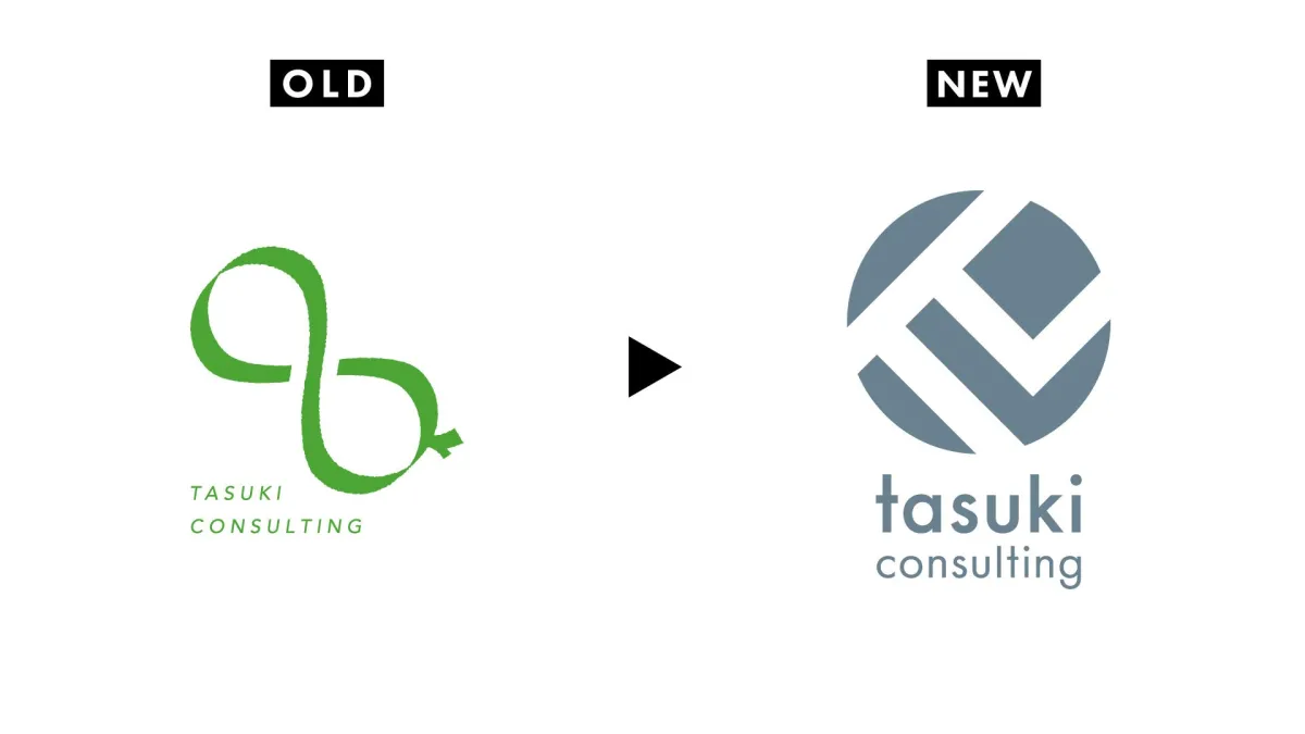
On August 3, 2026, TASUKI Consulting, a leading M&A advisory firm based in Tokyo, will unveil a refreshed corporate brand as it marks its 22nd year of operation. This update includes the introduction of a new logo and a redesigned official website, symbolizing the company’s commitment to connecting past efforts with future aspirations.
Background and Objectives
Since its establishment in 2005, TASUKI Consulting has dedicated itself to supporting small and medium-sized enterprises (SMEs) in navigating the complexities of mergers and acquisitions (M&A). With over 20 years of experience in financial and business succession support, along with 14 years of M&A advisory expertise, the company has built a strong reputation based on professionalism. The decision to revamp the corporate brand is aimed at more clearly expressing the company's mission to carry the legacy and aspirations of each entrepreneur into future generations.
New Logo Details
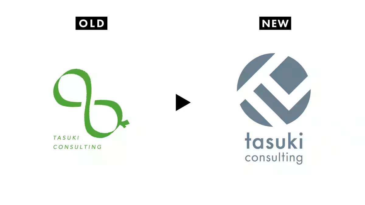
The newly designed logo, featuring the name “tasuki consulting,” embodies the concept of a “tasuki,” which symbolizes the connection and support in business management. The design creatively integrates the initials “T” and “C” while evoking the mathematical symbol for pi (π), which represents infinite connections. This infinite nature reflects the firm's dedication to addressing diverse client needs and guiding them toward successful outcomes. The logo's right-tilted angle signifies a multifaceted approach to problems, while the upward trend illustrates the company’s ongoing growth and development.
Corporate Color Philosophy
TASUKI Consulting has adopted a slate gray with blue undertones as its new corporate color. The gray represents a modest yet impactful presence, distinguishing the company from the more commonly used blue and green tones in the M&A industry. Complementing this is a blue shade that symbolizes sincerity, trust, and sound judgment, showcasing the firm’s commitment to supporting clients through significant decisions. This color choice also resonates with the traditional Japanese color, “Ainezumi,” which reflects historical sentiment and ingenuity.
Comprehensive Website Renewal
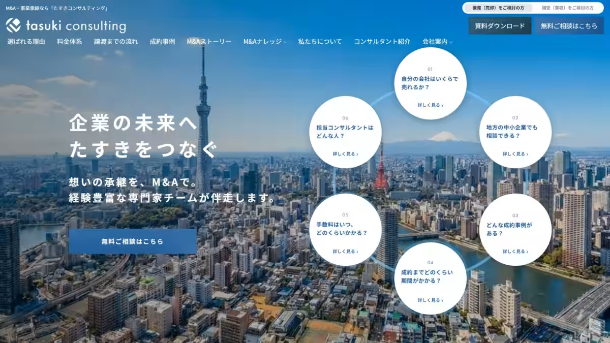
Alongside the logo launch, TASUKI Consulting will also refresh its official website entirely. This revamped site will clearly communicate the firm's unique strengths in financial, tax, and labor support for entrepreneurs considering M&A. The site will feature easy navigation to information regarding industry-specific achievements and a comprehensive pricing structure based on a success fee model. In addition, the website will enhance its educational resources with “M&A Knowledge” articles and a guidebook detailing market trends across various industries.
To explore the new TASUKI Consulting website, visit https://www.tasuki.pro/.
Company Overview
- - Company Name: TASUKI Consulting, Inc.
- - Location: 3rd Floor, Otemachi First Square, 1-5-1 Otemachi, Chiyoda, Tokyo
- - CEO: Shu Morita
- - Established: February 2005
- - Capital: 150 million yen
- - Services: M&A intermediary services, M&A advisory services, financial consulting services
- - Affiliations: Registered with the Association of M&A Support Institutions, M&A support provider registration with the Small and Medium Enterprise Agency
For more inquiries, please contact:
TASUKI Consulting Corporate Information Department
Contact Person: Samukawa
Inquiry URL: https://www.tasuki.pro/inquiry/
TASUKI Consulting is committed to supporting businesses in achieving their M&A goals with renewed vigor and a clearer vision for the future.
Topics Business Technology)
【About Using Articles】
You can freely use the title and article content by linking to the page where the article is posted.
※ Images cannot be used.
【About Links】
Links are free to use.