
Peter Pan Inc. Revamps Its Brand: Embracing a New Vision and Energy


Peter Pan Inc. Revamps Its Brand
On April 5, 2026, Peter Pan Inc., headquartered in Chiyoda, Tokyo, announced a comprehensive overhaul of its brand identity, including a new logo, website, and various promotional materials, initiated by its CEO, Mitsuki Kasai. This long-awaited rebranding marks a pivotal shift in the company's trajectory after two years of rapid growth and expansion.
Background of the Rebranding
The company is confronted with the inherent dilemmas in the recruitment industry as it expands. Peter Pan has decided to address these issues not with a heavy hand, but through a light-hearted and innovative approach. This philosophy led to the redefinition of their Mission, Vision, and Values (MVV).
New MVV (Mission / Vision / Value)
- - Mission: To be at the forefront of essential societal contributions.
- - Vision: To transform the dilemmas in the human resources sector.
- - Value: Embrace the Peter Pan Syndrome—foster a playful spirit.
Brand Concept
The cornerstone of this rebranding is articulated by the concept: “I PLAY, I FLOW.” This encapsulates the idea that through playfulness, the company aims to bring about dynamic change and evolution in its operations. "PLAY" embodies fun, flexible thinking, and agility, while "FLOW" signifies transformation and seamless transitions.
Visual Identity
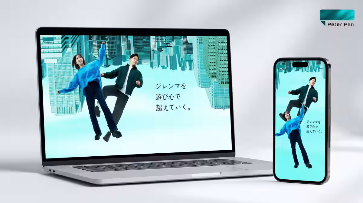
Inversion
The redesign includes the theme of Inversion, which suggests turning the world’s structures upside down and reinterpreting common beliefs. Inspired by rotating the letter “P” to resemble the number “1,” this symbolizes Peter Pan’s ambition to be the leading and indispensable participant in the industry.
Floating
Furthermore, the concept of Floating expresses liberation from constraints, highlighting both internal and external transformations.
Gradation
Visual expressions of Gradation capture the notion of continuous, smooth transitions rather than abrupt changes.
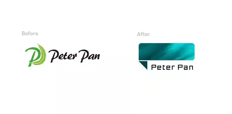
New Logo Design
Accompanying the rebranding is the introduction of a new emblem that aligns with the company's digital and technological trajectory while preserving the warmth of the original design. The shift from the old logo to the new symbolizes the company’s evolution into a more modern entity.
CEO’s Message
Mitsuki Kasai remarked, “This rebranding is not merely a cosmetic change; it reflects fundamental decision-making for our company. We have prioritized speed in our growth, yet I realized we haven’t conveyed our core values adequately to the outside world.” He emphasizes that Peter Pan will transform from merely being a recruitment agency to becoming a catalyst for societal change—armed with a playful spirit to creatively tackle heavy challenges.
Future Prospects
Looking ahead, Peter Pan aims to launch a robust recruitment platform, relocate its offices by July 2026 to accommodate growth, and expand into new business areas and products. In the long term, the company aspires to redefine its role as a leader and essential contributor to the industry.
With its new mission and vision, Peter Pan Inc. is set to embark on an exciting journey of transformation, and stakeholders are encouraged to watch this space closely.
Headquarters: 2-2-1 Kanda Nishikicho, 11F KANDA SQUARE, Chiyoda, Tokyo
CEO: Mitsuki Kasai
Established: October 2023
Business Focus: Recruitment and hiring support
Website: peterpan.co.jp

Topics Business Technology)
【About Using Articles】
You can freely use the title and article content by linking to the page where the article is posted.
※ Images cannot be used.
【About Links】
Links are free to use.