Phemex Unveils Revamped Logo and Platform Design for New Brand Era
Phemex Unveils Revamped Logo and Platform Design for a New Brand Era
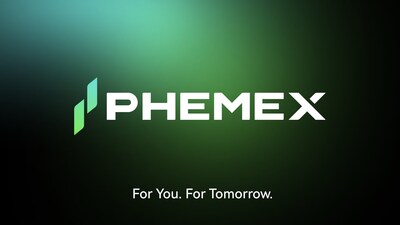
In a significant move for the cryptocurrency exchange sector, Phemex has revealed its freshly redesigned logo and platform layout, signaling the inception of a new chapter for the brand. This update is not merely aesthetic but embodies a strong commitment to evolution, growth, and user-friendly service.
A New Visual Identity
Phemex’s latest visual representation illustrates its journey from a high-performance trading hub to a robust digital asset platform. The reimagined logo, now featuring a dynamic design with dual candlesticks, symbolizes growth, movement, and upward momentum. This emblematic change also stands for balance, continuity, duality in performance, and reliability.
Color and Typography Enhancements
The updated color gradient transitions from deep green, signifying stability and trust, to bright blue, which conveys innovation and energetic forward motion. This unique color spectrum enhances the brand's association with prosperity and continuous improvement.
Moreover, the refined typography, built on a clear geometric foundation, replaces softer curves with sharper, more angular edges. This transition toward a more precise and exact typeface reflects the company's dedication to reliability and architectural integrity.
A Modernized User Experience
In addition to the logo and typography overhaul, Phemex also focuses on improving its platform interface. The modernized version includes updated 3D visuals, a consistent icon system, and light layouts that enhance usability and maintain traders' focus. This ensures that users experience a cleaner and more intuitive environment, whether they are on desktop or mobile.
Embracing Change while Staying True to Core Values
This update marks the third iteration of Phemex's logo since the exchange's inception. The original logo drew inspiration from the laurel crown of the Greek goddess Pheme, a symbol of triumph and prestige. Federico Variola, CEO of Phemex, stated, “Our new logo and platform design encapsulate what Phemex represents today — precision, performance, and progress. This redesign reflects a mindset that has always characterized Phemex: building for the future while remaining true to our roots of efficiency and reliability.”
The visual refresh lays the groundwork for a broader rebranding initiative set to roll out in the coming weeks. Phemex has plans to introduce a new branding house and unified identity system, which will represent its long-term vision — redefining what efficiency and trust mean in the future of digital finance.
About Phemex
Founded in 2019, Phemex is recognized among the most efficient cryptocurrency exchanges worldwide, gaining the trust of over six million traders. The platform provides spot and derivatives trading, copy trading, and asset management products, combining seamless functionality with institutional-grade security. Phemex prioritizes user experience and transparency, which are fundamental in a sector where trust is paramount. For more information, visit Phemex.com.


Topics Consumer Technology)


【About Using Articles】
You can freely use the title and article content by linking to the page where the article is posted.
※ Images cannot be used.
【About Links】
Links are free to use.