
株式会社CODATUM Launches Revolutionary Map Chart Feature for Codatum BI Tool


Introducing Codatum's latest innovation in BI tools
CODATUM, a pioneering startup based in Tokyo, has recently announced the launch of its groundbreaking Map Chart feature as part of their next-generation Business Intelligence tool, Codatum. This new feature enables users to intuitively visualize geolocation data on a map, enhancing the overall data analysis process and making swift, data-driven decision-making accessible to everyone.
What is the Map Chart Feature?
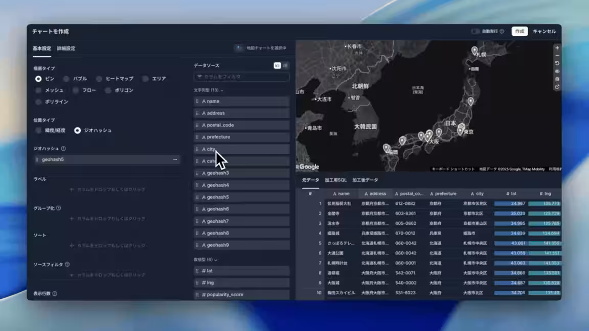
The Map Chart feature is designed to visualize data that contains geolocation information, allowing users to easily grasp geographical trends and patterns. With this tool, users can generate data visualizations directly on maps using only SQL to extract the necessary data. Here are some key characteristics of this feature:
- - Flexible Visualization Types: Users can choose from 8 different drawing types, including Pin, Bubble, Heat Map, Area, Mesh, Flow, Polygon, and Polyline, enabling them to select the optimal representation based on their data's unique characteristics.
- - Variety of Geolocation Formats Supported: The feature accommodates diverse location data formats such as latitude and longitude, geohash, administrative area codes, and GeoJSON, ensuring that users can work with data in the format that best suits their needs.
- - Standardized Administrative Data: Codatum incorporates comprehensive administrative area data from across Japan, covering all 47 prefectures, approximately 1,900 cities and towns, and postal codes. Any data queries containing administrative area codes will automatically render the corresponding geographical boundaries on the map.
- - Color-Coding for Grouping: The functionality allows users to visualize multiple axes simultaneously using color-coded displays grouped by categories.
- - Google Maps Integration: Users have the option to utilize various map types, including satellite imagery and terrain maps, thanks to seamless integration with Google Maps.
Key Features of Map Chart
The flexibility of the Map Chart is notable, allowing real-time changes in how data is displayed on screen, whether it's locating stores with Pins, demonstrating values with Bubble sizes, or showcasing density using Heat Maps. Users can easily toggle between different visualization types based on the properties of their data.
Moreover, it boasts built-in geolocation data from Japan, which aids users in producing accurate maps simply by inputting SQL queries that include administrative area codes (e.g., '13' for Tokyo or '13101' for Chiyoda City). This level of automation in geospatial representation greatly enhances user experience and efficiency.
Additionally, by supporting various location data formats such as latitude-longitude pairs or geohashes, users can effortlessly visualize information without needing to convert formats, simplifying the data management process.
Ideal Use Cases
This versatile tool can be utilized across various industries, with several practical applications identified:
- - Retail Sales Analysis: Business owners can visualize sales data by prefecture or city, facilitating informed decisions regarding expansion strategies through clear geographical comparisons.
- - Logistics Route Optimization: Logistics teams can visualize delivery quantities and routes, identifying bottlenecks in the process by adjusting their visual representations accordingly.
- - Real Estate Analysis: By visualizing property availability and pricing around stations, marketing teams can determine supply-demand dynamics effectively using Bubble Charts.
- - Customer Distribution Analysis: The marketing department can create Heat Maps to highlight customer distribution, allowing strategic advertising and campaign planning in concentrated areas.
Access and Conditions
The Map Chart feature is already available to users on all service plans. For more information, please visit the Codatum service URL: Codatum Map Chart and the documentation at Codatum Documentation.
About Codatum
Codatum is an advanced BI tool that leverages AI and Notebook technology, enabling teams to handle data with ease and precision. Its design combines AI, SQL, and no-code capabilities to facilitate rapid analytics while allowing for seamless sharing of results. The intuitive Notebook layout showcases SQL outputs instantly, while users can interact with AI for in-depth inquiries without a steep learning curve.
Through a highly visual and user-friendly interface, Codatum aims to transform data into strategic business assets, fueling effective decision-making.
For more about Codatum and its offerings, visit Codatum Homepage. Inquiries can also be sent for trial access, featuring a month-long trial for full functionality and free usage plans available at Codatum Pricing.
About CODATUM
Founded in October 2023 as a spinoff from Plaid, the company focuses on unlocking the infinite potential and speed of software and data, aiming to empower enterprises in maximizing their data capabilities through intuitive and extensible tools.


Topics Business Technology)


【About Using Articles】
You can freely use the title and article content by linking to the page where the article is posted.
※ Images cannot be used.
【About Links】
Links are free to use.